Lew & Huey are consistently releasing cool, affordable watches. The brain-child of Chris Vail, a much loved member of Watchuseek, he uses all of his experience and knowledge of being experienced on the buying side of affordable watches to create high quality, low priced watches that we all want, as he would.
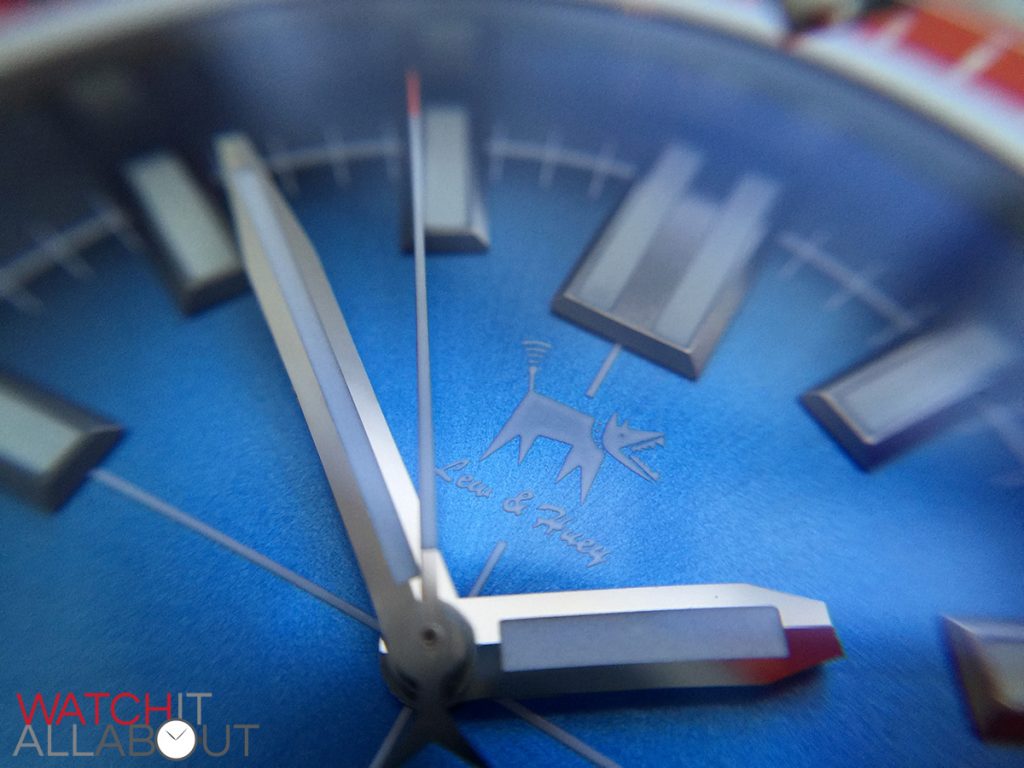
Orthos is a two-headed dog in Greek Mythology who is a doublet (“brother”) of Cerberus. And believe it or not, these are the names of Lew & Huey’s latest releases. Chris must really love dogs (in case you haven’t noticed, the L&H logo is a dog called Sparky). Maybe he’ll eventually release a watch named Einstein after the dog in Back to the Future.
Anyway, the Orthos is what we’re looking at in this review today. Costing £312 / $470, we’ll see if it’s a good enough watch to warrant his “affordable” legendary status.
The case
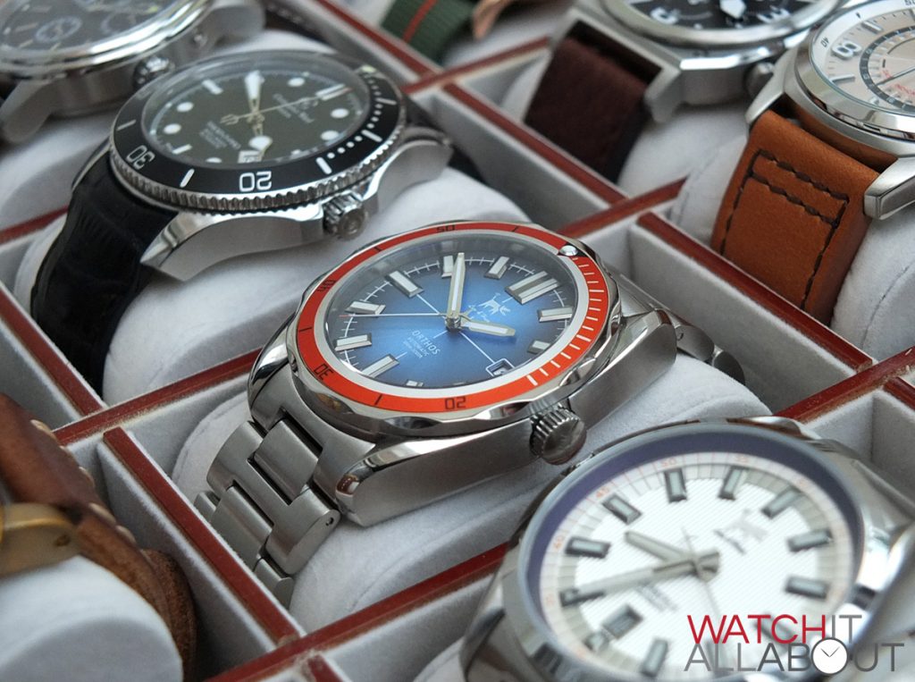
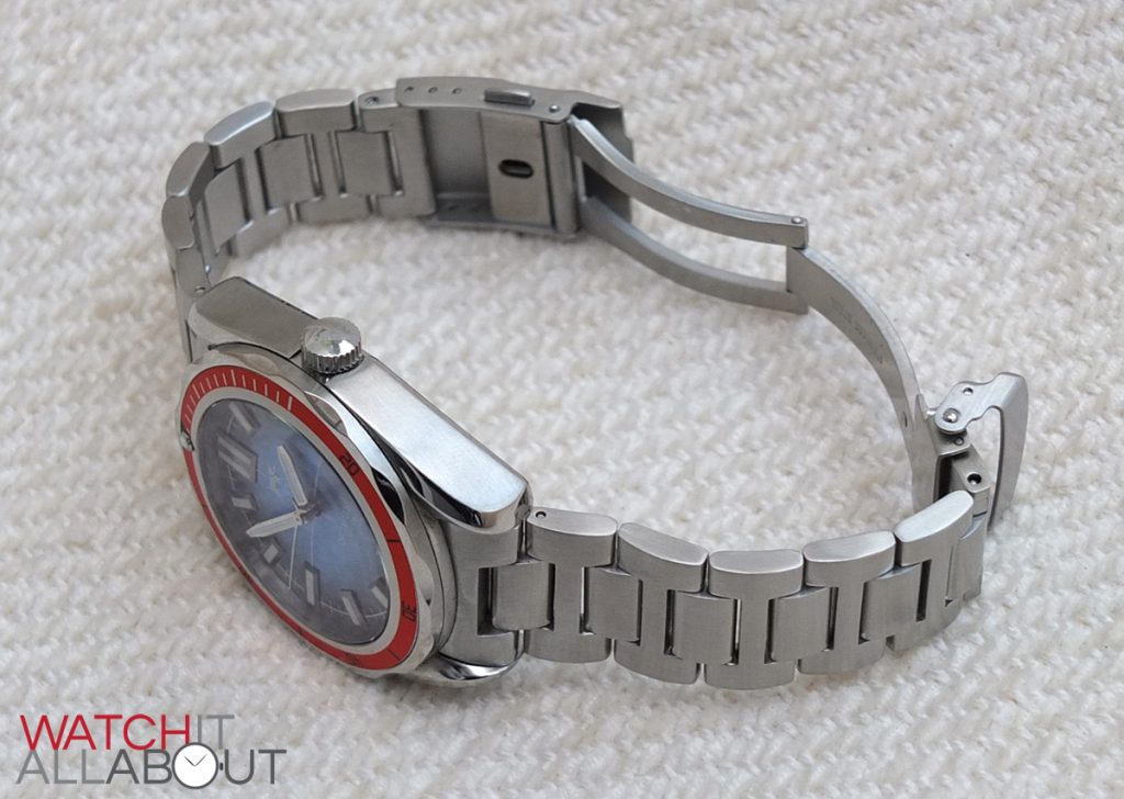
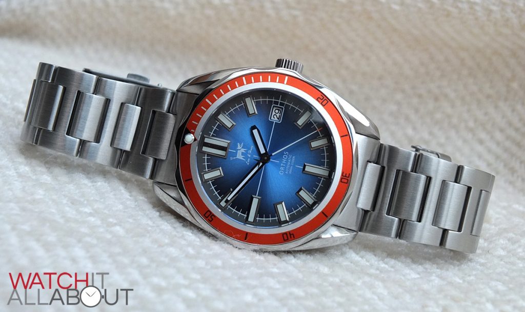
The case is very chunky, which is a word we’ll use quite often in our review. The whole watch as a whole is heavy, industrial, and feels solid and well-made.
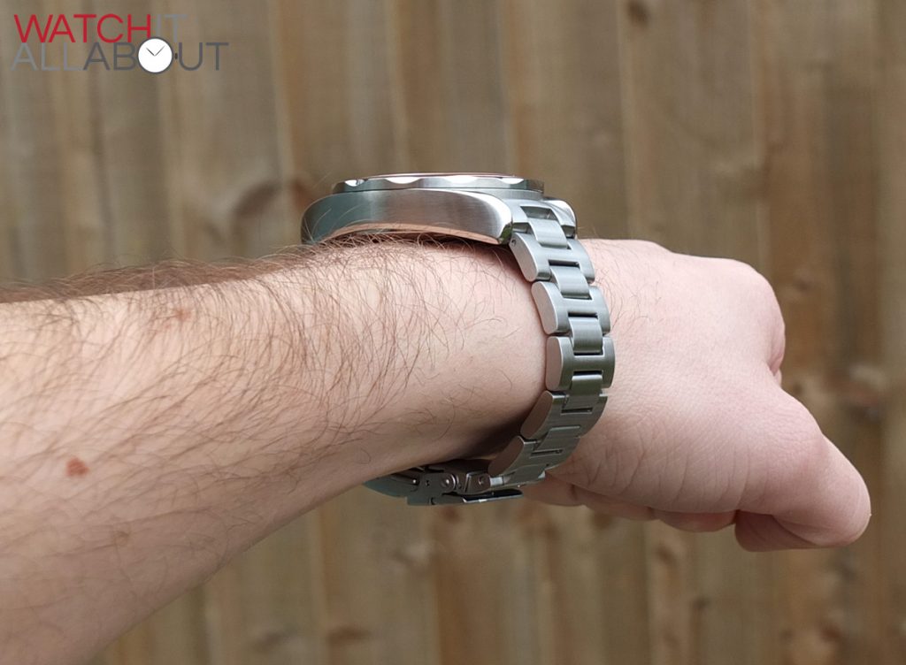
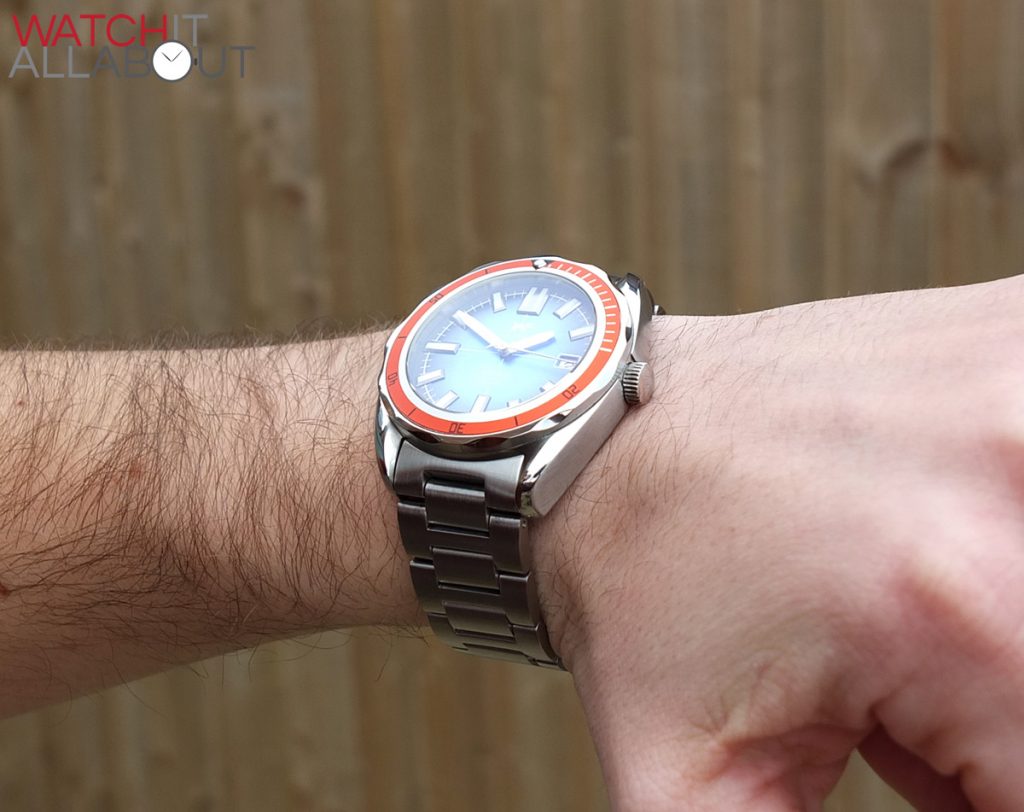
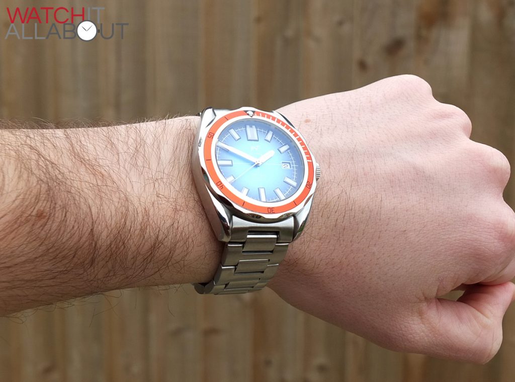
Weighing in at 210g, it certainly doesn’t mess around in the heft department. You definitely know it’s there whilst wearing it. For some, this can be a put off, but for others like me, I love a massive, heavy watch on my wrist. It tells me that it’s great quality and is made well. The case measures in with a diameter of 42mm, 50mm lug to lug, and a height of 13mm.
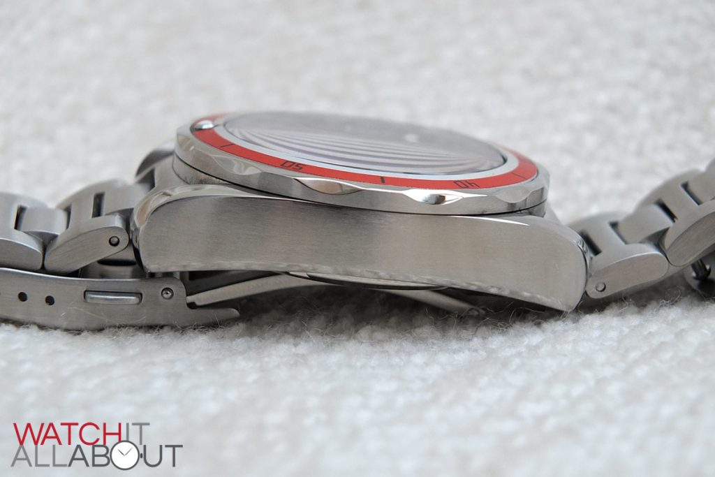
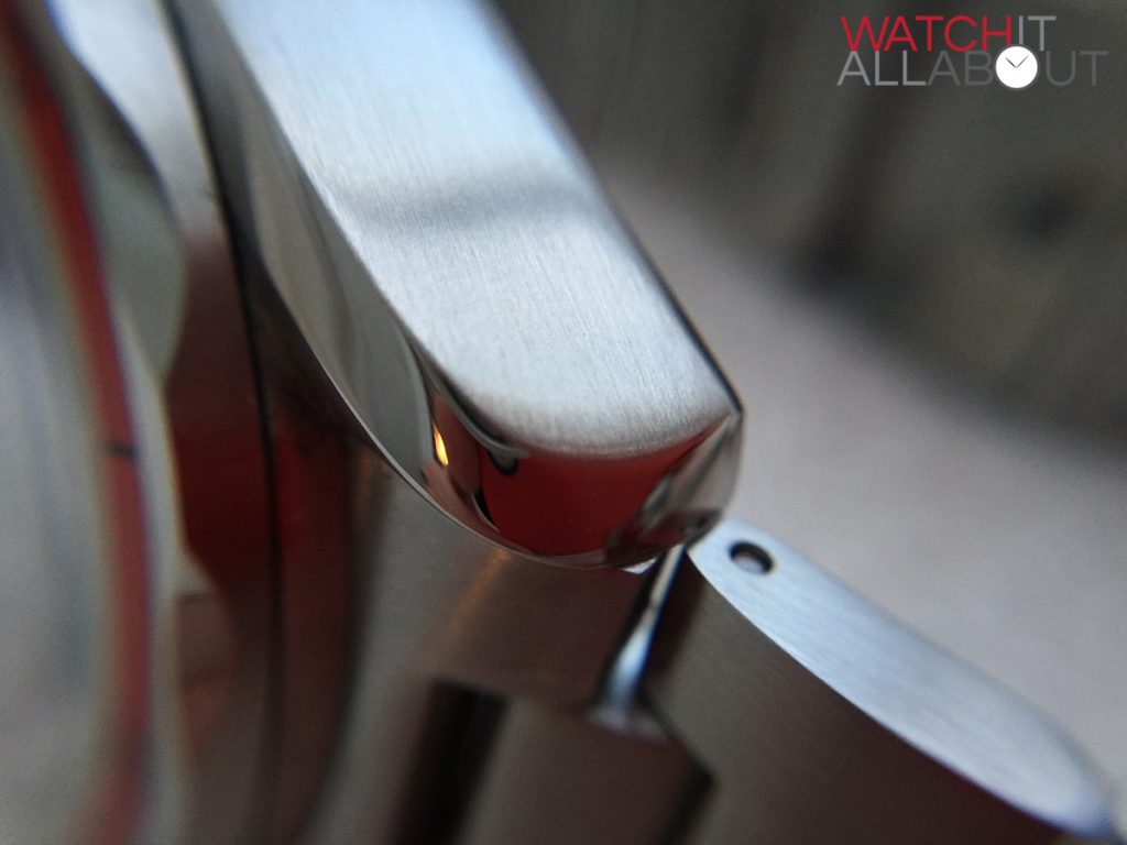
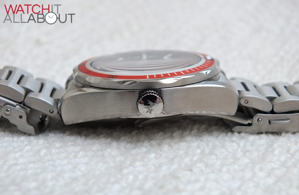
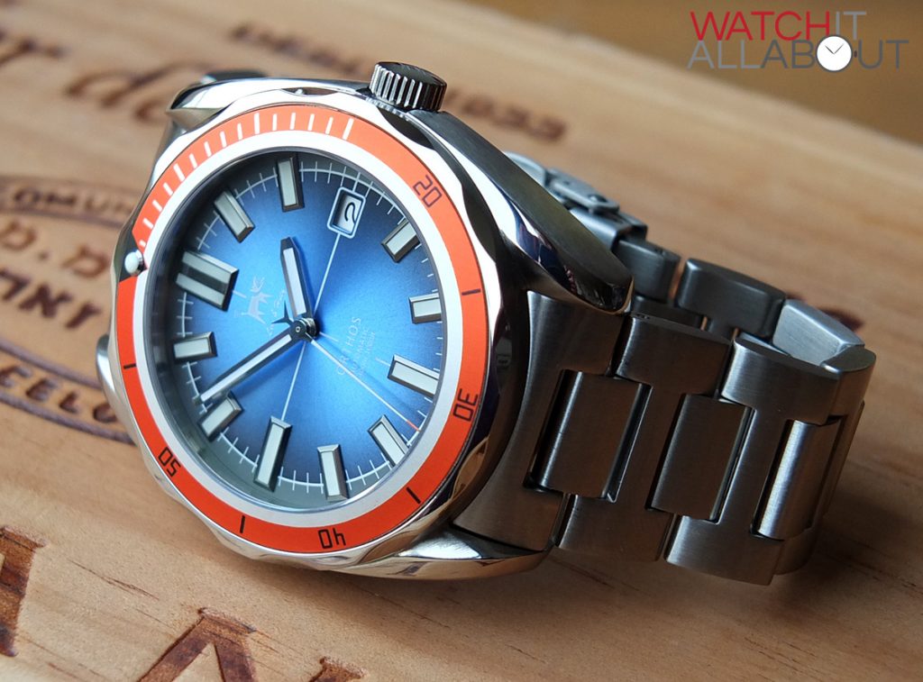
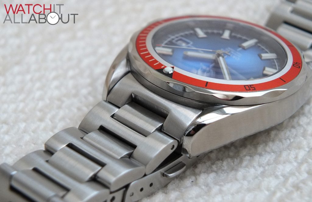
The case is made of 316L stainless steel and has a variety of finishes. The top and bottom corners are polished, with the rest of the main case being a gentle brushed finish. You can tell it’s a well made case by how well the different finishes line up next to each other. In the instance of the top polished corners, the join where it meets the brushed sides is very definite and impressive.
The shape of the case is a definite flat slab, which ever so slightly arcs around the wrist, with downward tips where the lugs end.
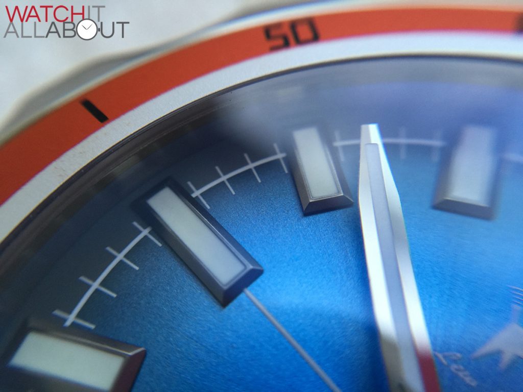
The sapphire crystal is slightly domed, resulting in slight distortion at the sharpest angles. It does have a decent anti-reflective layer on the underside, keeping any of those nasty reflections at bay. I’m not too sure on how thick the crystal is, but I’d be happy in saying that it’s thicker than usual – all because of the noise it makes when you tap it. It gives off a very satisfying thump, sounding very much like the crystal on the Christopher Ward Trident, which is over 3mm thick.
This thick sapphire crystal is most probably to do with the watches 30ATM / 300m water resistance rating, which is very good – it’s a full-on no-nonsense divers watch, and it’s specced to be too.
Of course, in addition to the crystal, the crown and caseback are both screw-in too, which is paramount for a depth rating like this.
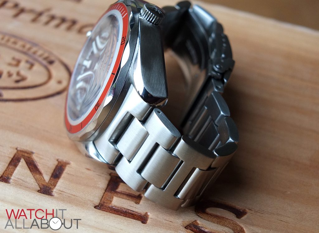
The crown has a nice deep engraving of Sparky, the Lew & Huey dog, and the grip is effective, but not too sharp. It’s polished, providing a contrast in finish down the right flank of the watch.
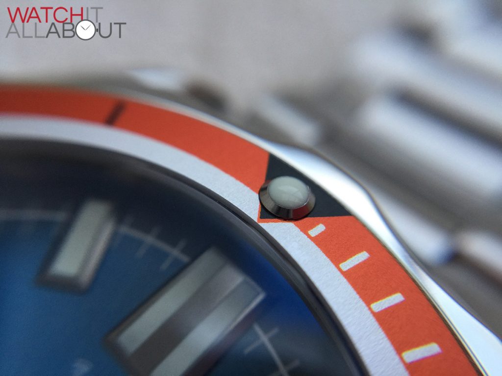
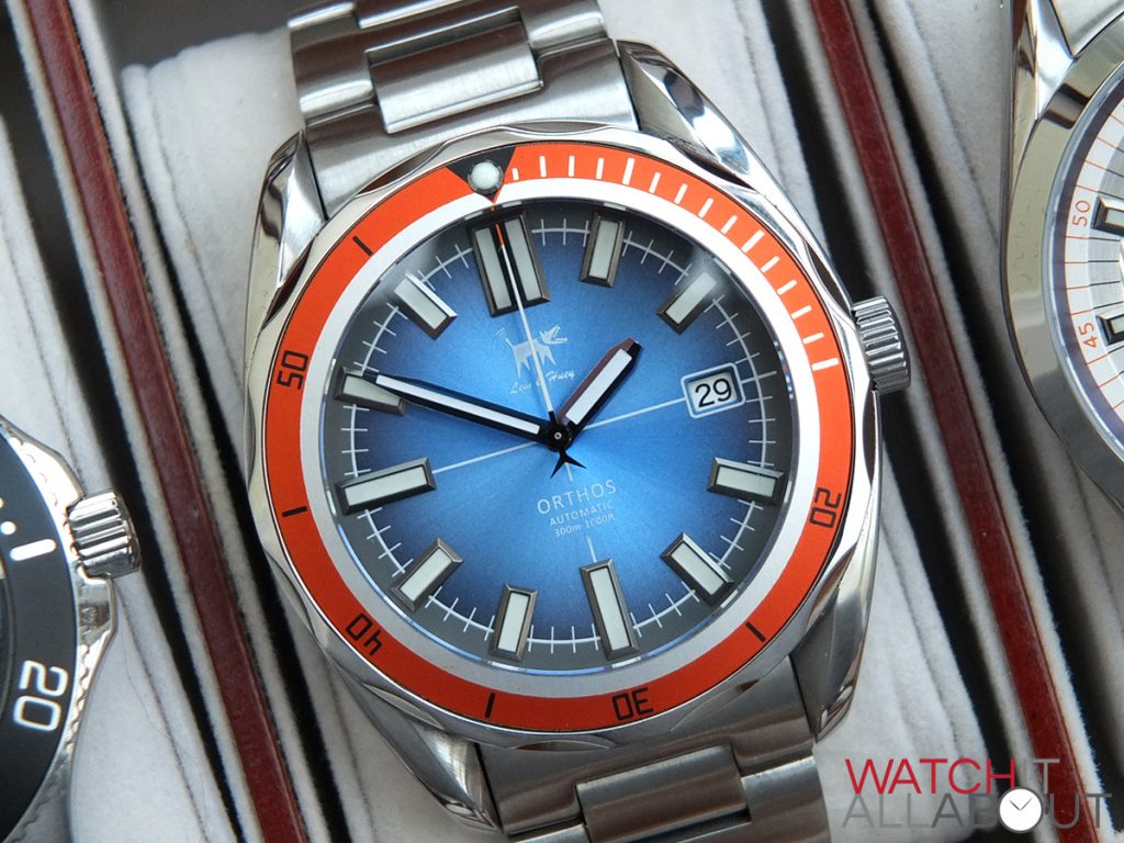
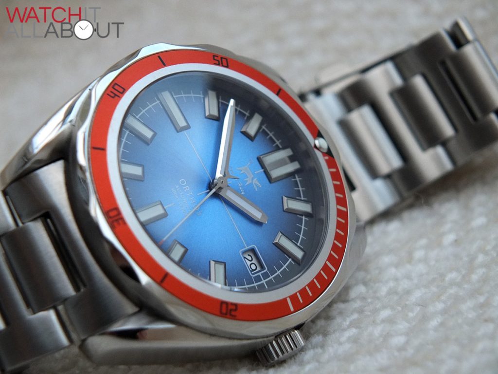
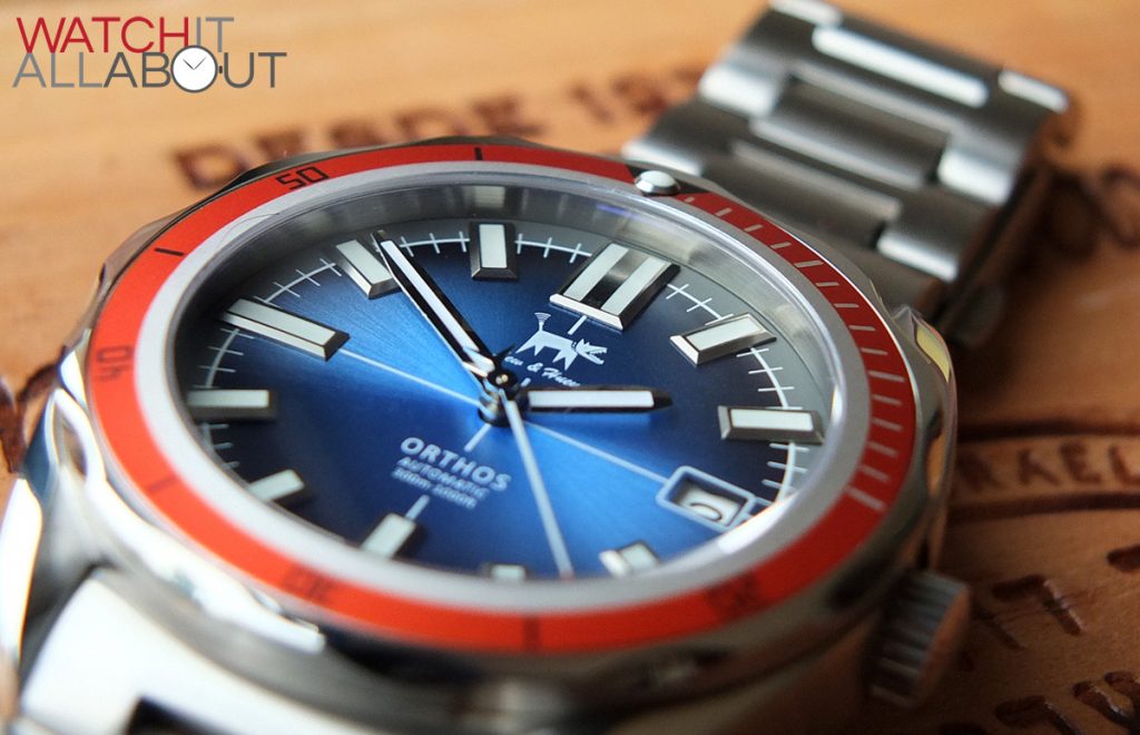
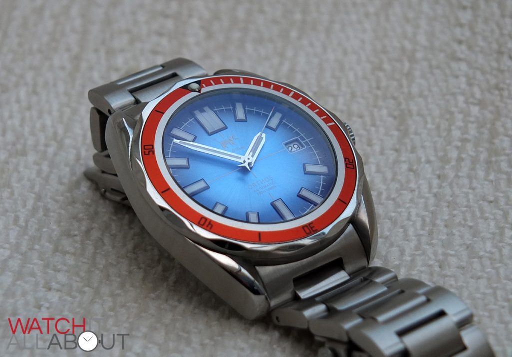
The 120 click bezel is very well made and has a smooth action to it. I know that Chris Vail is a real stickler for decent bezel action so to be honest it was expected that the Orthos would perform well in this regard. The orange insert is the main provider of the likeness to the Omega Plant Ocean, which I thoroughly love (it’s my grail watch, after all). The printing on the insert is all crisp and clean, as it the triangle at 12 holding the lume blob. The edging and grip of the bezel is smooth, and is again impressive how it has a brushed outer edge and a polished top. The grooves are a positive design feature too, providing a variety of edges and reflections when the light hits it.
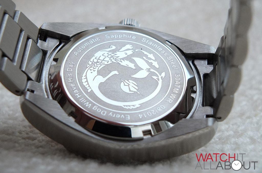
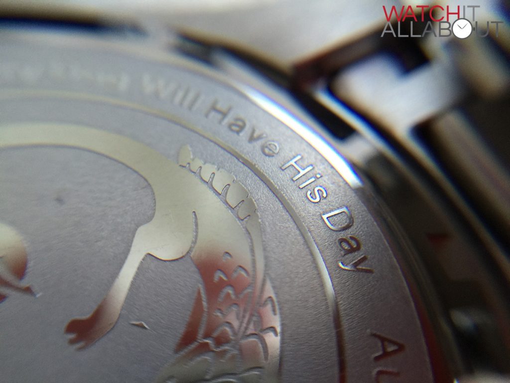
The caseback is fully polished, although the majority of it is etched in to create an image of Orthos, with the watch specifics circling around him. This is surprisingly detailed and clear.
In general, the case is clearly made to be dived with. It’s a beast and is pleasantly well made.
The dial
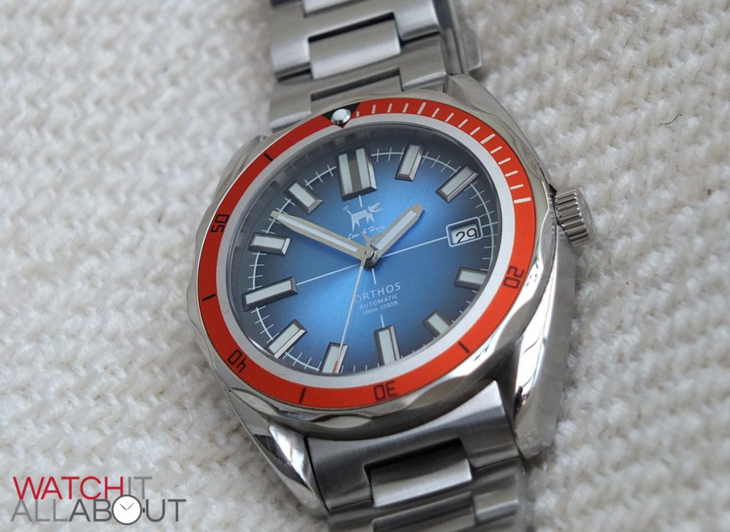
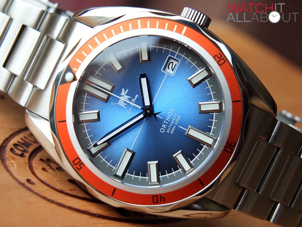
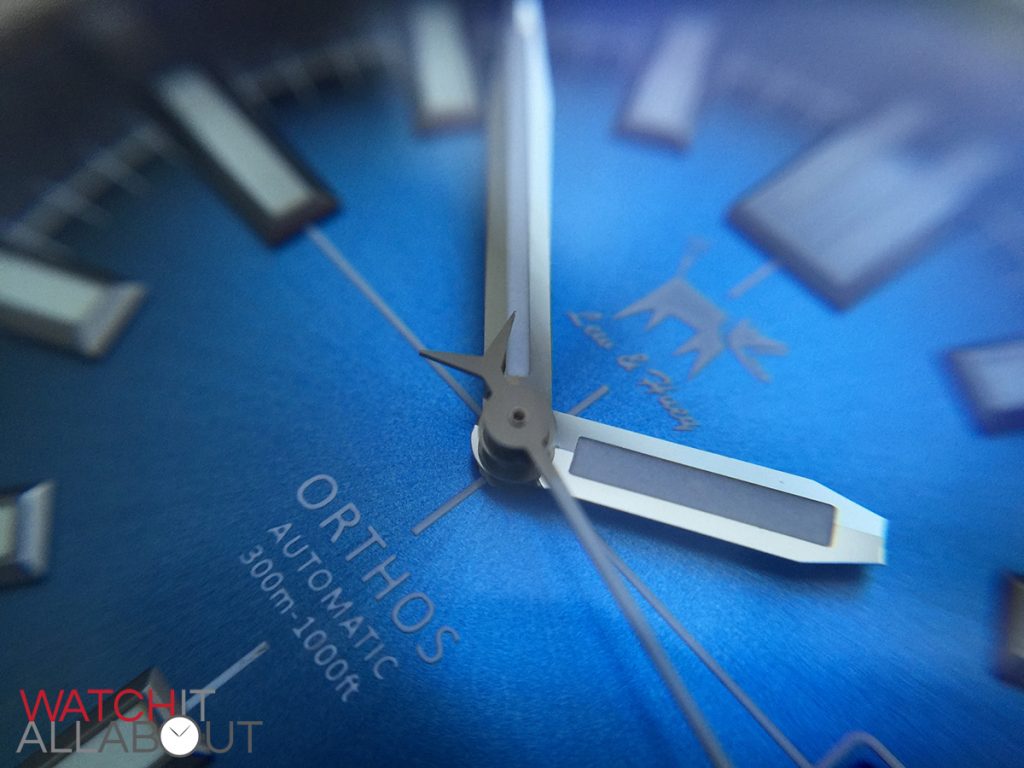
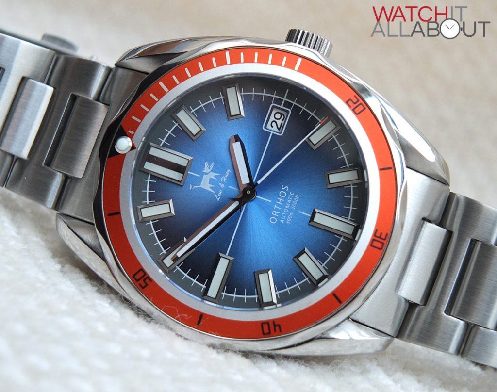
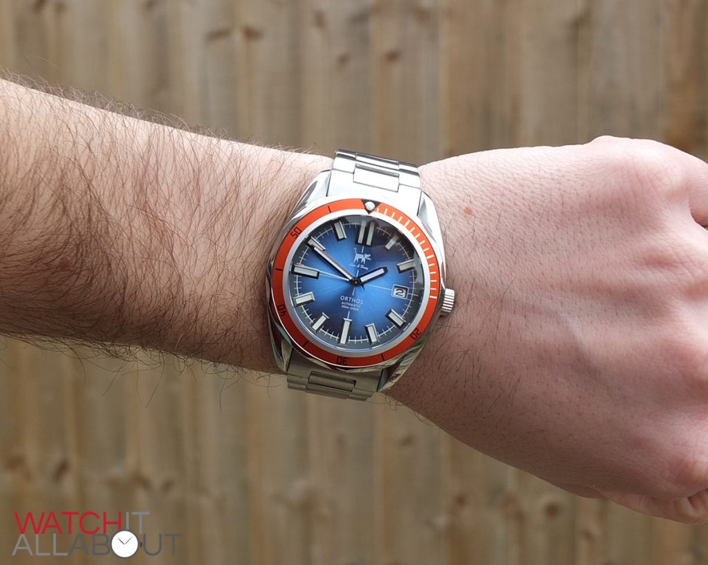
The one main characteristic of the dial in my mind is the eye-catching sunburst effect it produces. Fading in from a light blue in the centre, to a dark blue around the outside of the dial, it also has an outwards brushed finish to it accentuating this pleasing visual effect.
Another subtle, yet pleasant characteristic is the fine crosshair. The white printed lines are fine and precise, so they’re not overbearing on the design, yet provide simple lines splitting the dial up, keeping it interesting.
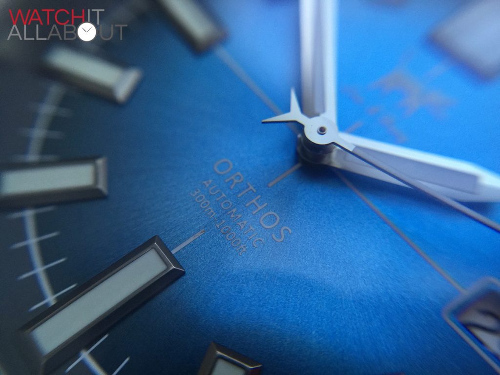
All the printed elements are printed in white ink. This means that the white logo located in the top half, the and writing “Othos, Automatic, 300m / 1000ft” in bottom half can be little hard to read at times if the sunburst effect covers them.
If there’s one good thing I like to see on a watch, that’s decent applied hour markers. I’m pleased to say that the Orthos definitely has them. They’re all very nicely made, being pitched rectangles with a lumed centre. There is a double rectangle at 12, with the rest being single and in two lengths: longer for 6 and 9, and shorter for the rest (there isn’t one at 3 due to the date window). These are all very neat and tidy in their construction, and a little industrial in their appearance.
The hands are of a similar chunky design. They’re slightly pitched, with a thick outer polished steel border and lumped centre. Both are pointed, but with a flat tip. The minute hand has a longer point, and the hour hand has a very stubby point – all adding to the burly aesthetics of the watch. The second hand has a nice “V” counter weight, another cool little design feature.
The minute track is printed white, and serves as a border between the main blue sunburst inner section of the dial and the grey outer ring. Every minute mark is a white dash protruding both sides of the border, into both the blue and grey areas.
This grey outer ring is a welcome aspect of the dial; it splits it up well without being too brash. I think this is a case of clever design as if the entire dial was the blue sunburst, it would have looked too much and would have been too bright and loud.
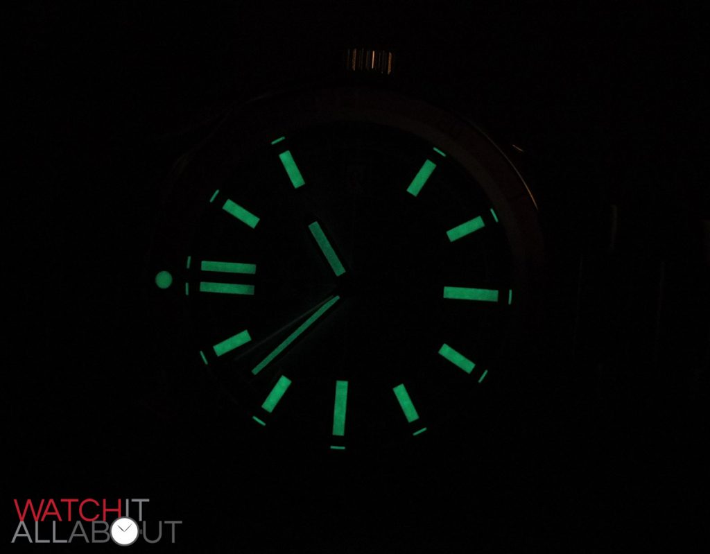
The lume is of acceptable strength, you notice it’s charged well when you are outside in the daylight and come inside into a darker room. It glows a strong green, although doesn’t last a crazy amount of time, albeit a lot better than other watches at this price point.
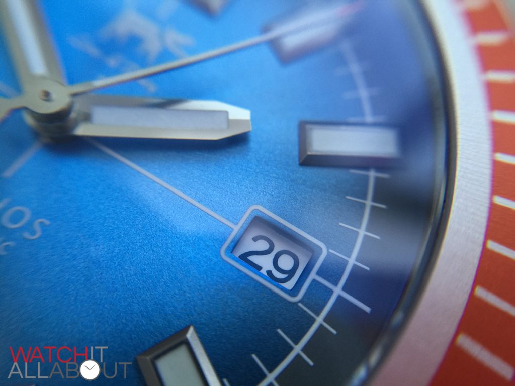
Finally, the date window is located at a very reasonable position at 3. It’s nice and neatly cut out of the dial, and has a white border printed around it, linked to the crosshairs mentioned previously. Due to the amount of white printing on the dial, I think the colour of the date wheel suits (some people are adamant that the wheel should match the colour of the dial).
To conclude; a solid, well designed dial with splashes of uniqueness mean it’s really eye catching.
The movement
The movement in the Orthos is the Seiko NH35 (4r36). Known as one of Seiko’s workhorse movements, it wouldn’t be a surprise if it lasted for 15 years without needing a service.
It is a reliable and robust movement based on the solid 7s26 calibre, but with the added feature of having a hacking seconds hand and hand winding ability.
The movement has received an incredibly positive reputation for its accuracy, and is usually regulated to 15 secs a day straight from the factory.
As was mentioned before, the NH35 is hand windable and is an automatic movement, and runs at 21.6k bph which equates to 6 ticks per second. It has 24 jewels and a power reserve of 41 hours.
The rotor provides bi-directional winding, so no matter which way it spins it winds the movement, which is good. Some of the budget movements are only uni-directional, so they wind at half the speed.
Personally I think it would have been nice to see the high-beat Miyota 9015 movement in the Orthos, but only because of the higher beat rate. I understand the Seiko NH35 is actually a *better* movement. It will most likely last well over 10 years without the need of a service, as most Seikos do.
The strap
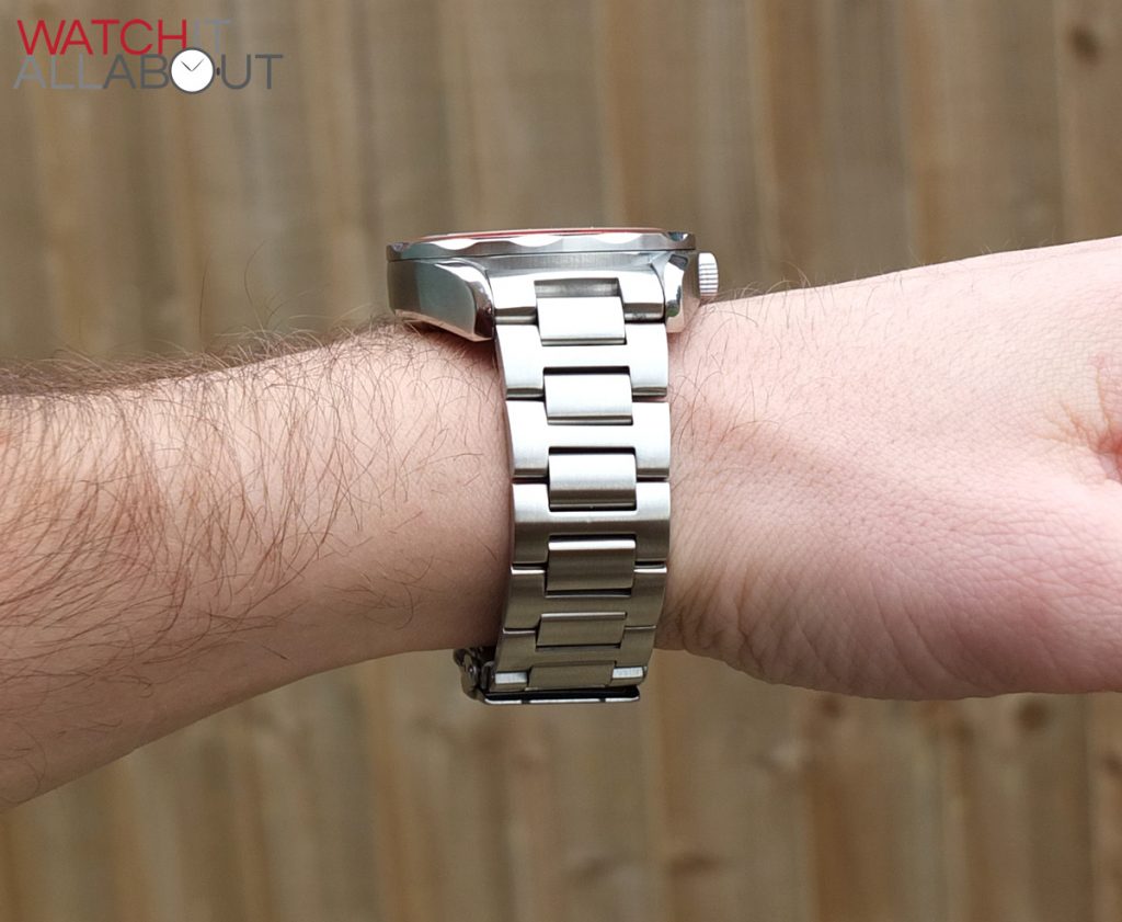
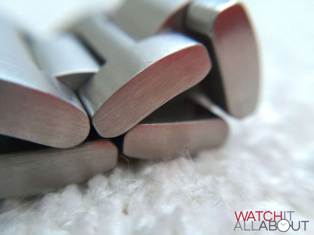
The bracelet is another excellent aspect of the Orthos. Much like its big brother, the Cerberus, the fully brushed stainless steel bracelet is excellently manufactured and is very comfortable to wear.
It’s very chunky, which I personally love on a bracelet. It measures 22mm wide at the lugs, quickly reducing down to 20mm (within the first 2 links), so it’s pretty impressive on the wrist. All the links are thick, and it’s very important to see it boast solid end links.
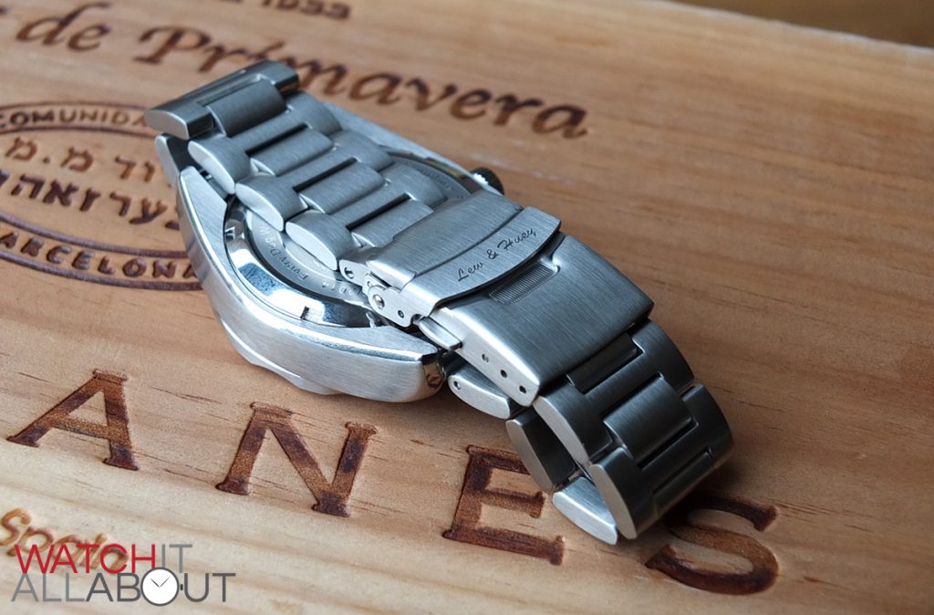
I also like the design of the bracelet, in particular, the decision to use “H” links. I have a soft spot for this style, probably because it’s not as common as other more popular styles. All the H links and the smaller joining links are well oiled and silky smooth.
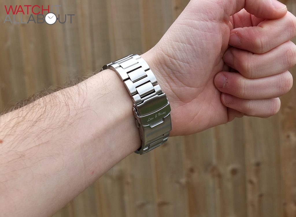
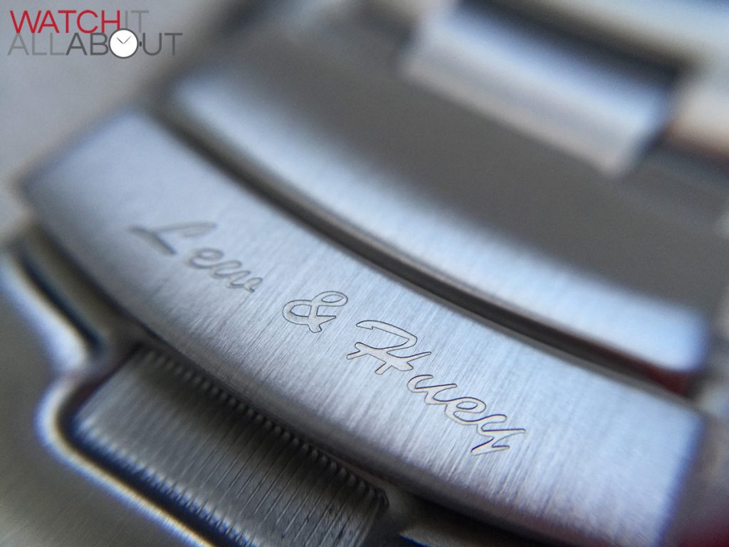
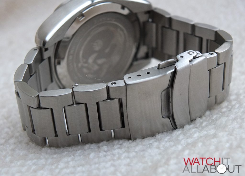
The buckle is double locking, so reassuringly secure on the wrist. It’s pretty brawny and sturdy, built in an equivalent manner to the case and rest of the bracelet. The first lock is the top flap, which houses a deep engraving of “Lew & Huey”. The second lock is the buttons either side of the buckle, which you have to depress in order to open up the clasp. So no, your Orthos is most definitely not going to pop off your wrist unintentionally.
Whilst the bracelet is meaty and heavily built, there is one thing that I need to mention: that is he fact that the bracelet is sized up for giants. Chris Vail must have super large wrists, as I’ve had to take out ALL the removable links on the bracelet to make it anywhere near a decent fit for me. I’ve also adjusted the micro-adjustments on the buckle to the tightest, and it just about fits me now. So just a note – if you have a wrist smaller than 7.5” like mine, you may struggle to resize the bracelet small enough. To be honest, I’m sure Chris will be able to help you out, but it was worth a mention.
The competition
The affordable divers watch category is a very busy one indeed. At around the same price point, two competitors worth thinking about are the Steinhart Ocean 1 and the G. Gerlach Otago.
The Steinhart Ocean 1 is extremely well known and highly regarded as being a solid Swiss Made watch. But, it’s not very imaginative and is a blatant homage to the Rolex Submariner.
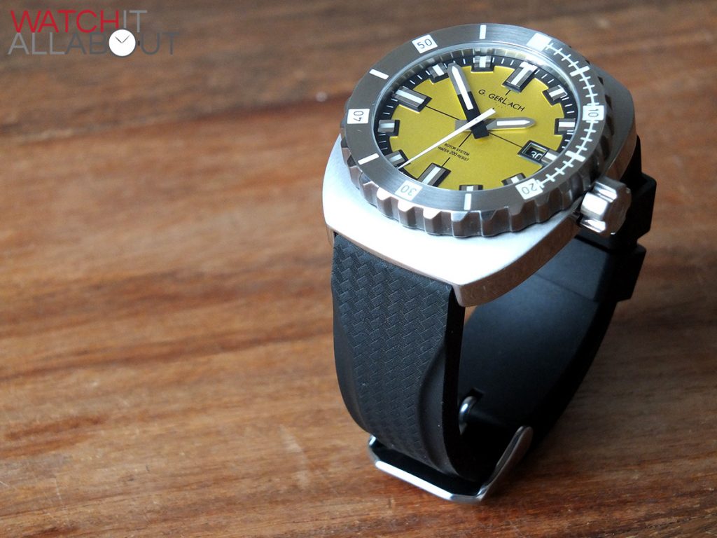
The G. Gerlach Otago comes in at cheaper than the Orthos, at around £230. You get a similar high quality build quality and movement. It can be a little too out there for some in the looks department though.
Final comments
I personally think that the Orthos is a great looking and sturdy watch for the price. The Omega Planet Ocean is my Grail watch, so anything that slightly resembles it is a winner in my eyes. But the Orthos isn’t a full-on homage. It definitely has unique and individual elements which make it different to what else is currently available. I’m impressed by the overall quality of the watch, the finishing is great and you can’t complain at the decent spec too. So if you’re looking for a well made, high quality watch that has a splashing of Omega, the Lew & Huey Orthos is the one for you!



James T
12 February, 2015 at 2:45 pm
Not gonna lie this watch is pretty ugly. Especially the dog logo, it looks like it was designed by a 2 year old.
Truth
12 February, 2015 at 10:06 pm
There is a reason why no one is lining up to buy Lew Huey watches.
http://tinypic.com/r/2chx7us/8
Johnny the dirty
18 February, 2015 at 11:35 am
This watch is gorgeous! and the logo with the dog is very cool.
I like to keep a Japanese movement rather than Swiss.
Not for suckers.
BigelowApo
19 February, 2015 at 2:01 am
This watch would look much more appealing in a black or blue version. To me It looks way too much like a direct Omega homage. I’ve spoken to Doc directly on WUS and he’s a very colorful character which is reflected in his watches. However, sometimes the colors and design don’t always go together well. I wish him the best of luck and hope that he comes out with a cleaner design on the next watch.
MarcusMorris007
10 March, 2015 at 12:56 am
Ouch another design flop from Lew & Huey. It really disappoints me as I really liked the Pan Europa Chrono homage they produced years ago. I actually emailed the owner to see if there was any chance he would bring it back and he replied “NO” and that was all. Not the friendliest fellow. I guess some micro owners don’t have time to give proper customer service. No reason to be cold to potential buyers.
peterlonz
12 March, 2015 at 1:02 am
First this is a really thorough & fair review of a watch from a brand I had not even heard of before.
The high quality video & pictures are the next best thing to a direct hands on evaluation
It seems from the comments that some love the overall look ( as do I ), yet others strongly dislike it.
I find this surprising since it’s clear that manufacturers of these watches (divers style) strive to offer variants from the “submariner homage” to more individual presentations. Some of the latter are just in bad taste, others will appeal to the bells & whistles brigade, & others, like the watch reviewed, strike a reasonable balance.
Specific to this watch there are several design elements that I think are not well handled:
1) No protection for the crown, something most other designers of 200/300 metre watches seem to consider important.
2) Damage prone protrusion of the lume button on the bezel at 12 o-clock. In practice this is not needed.
3) The material of the bezel is not stated, but regardless there is no effort here to provide any edge protection to the most damage prone element of any divers watch. Whether diving , snorkeling off the rocks, or just in every day use the bezel gets knocked around on anyone’s wrist.
4) It appeared to me that similarly the saphire crystal edge was protruding slightly, providing yet another damage prone area to the inevitable knocks & bumps of everyday use.
You may have gathered that I believe watches of this type in particular, should be entirely fit for purpose, & most have one or more of the above described shortcomings.
Unless you keep your watches for occasional use only, or as part of a collection, you will find in just a few years that you need a new bezel at least. If you think you might go 10 years good luck finding the spare part, even if your Auto movement still works.
The link posted above: http://tinypic.com/r/2chx7us/8 does not give much confidence that this company intends to focus on long term availability of spares?
My final comment: Do you want a watch that features a Seiko “workhorse” auto movement?
I’d feel much better if the auto movement was “top of class” if from another watch manufacturer.
If price point is an issue why not make this watch available at lower price with a Japanese quartz movement – I’d seriously consider buying it then because I am not a watch snob who believes that a decent watch can’t be quartz. Go use a quartz every day as your beater for 20 odd years & discover the accuracy & low maintenance. And only you know it’s quartz!
Umami G
19 March, 2015 at 6:38 am
Wow what a lazy uninspiring design. The Microsoft word italic typeface doesn’t help either. The designer was too lazy to hire a professional designer to create a logo and font. This looks like a $100 homage watch that I can buy from Parnis or Alpha. I bet the quality is similar as they’re all made in China.
Parsonz
24 March, 2015 at 3:30 am
Disagree with many of the commenters here. I actually think the design overall is not bad if there were one thing that would be a con about this watch is that the average non-WIS would probably not buy this watch due to unflattering and nontraditional color combos.
I’ve spoken to Doc personally a couple times and he’s a really nice guy. Although I do agree that he needs to maybe sometimes control his temper especially when he’s dealing with his customers. Overall solid design I would prob snag this up if there were some more normal color combos.
chiveone
26 March, 2015 at 1:06 pm
You’ve got to be kidding me he named his brand after Huey Lewis and the News a sh**ty 80s band? Oh god what a stupid brand name.
Bob Sackamano
20 April, 2015 at 1:59 am
No, it’s not named after Huey Lewis & The News.
Jonas Jerebko
21 April, 2015 at 8:18 am
Very unfortunate brand name and logo branding. I don’t think this brand will be around for the long haul.
atomiceve
6 May, 2015 at 8:29 pm
Gotta agree with the commentators the logo really turns me off. I love the orange bezel and I’ve been looking for a cheaper alternative to the Omega PO. I would be willing to buy one if there was no dog logo. Do you think this brand will accommodate custom orders?
mapman
21 May, 2015 at 6:51 am
Chris Vail owner of Lew Huey is the same douchebag that got me banned from watchuseek because I called his watch a homage. Guy is a total asshole to his customers. It’s funny that everyone clowns his brand on every forum NOT named WUS.
Pete
7 March, 2016 at 11:02 am
Blimey! There are some really negative comments here but you know what? I can’t buy a watch based on whether it’s a forum favourite here or there, whether the owner of the company is a total kiss-arse or not, or whether there’s some kind of tenuous word connection – or not – with a brand of dogfood, a long-long pop band or involving a completely made-up word. No. I’m going to buy a watch because I like the way it looks, I like the specification and I like the price. Isn’t it the truth that most watches are bought by people who have better things to do than fanny about on the internet?